Mobile pages UI
The update 9 of Sage X3 provides a new user interface suitable for both mobile phones and tablet devices. This document describes the new user interface.
The technical repository describing the new dashboards is different, and it is detailed in the following document. On the server, the description of classes and representations used remains the same although improvements have been made.
From a user interface point of view, the navigation and the behavior of the mobile pages are slightly different for following the reasons:
| This document details how these new mobile pages work for the following topics: |
|---|
|
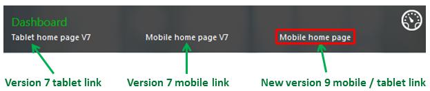
When a user connects to a Sage X3 site in product update 9, the user preference panel shows various links at the bottom. For compatibility reasons, the links to the two previous clients (the mobile for version 7, the tablet for version 7) are still available. A new link on the right provides access to the new product update 9 mobile/tablet client:
The primary access URL is different for each UI and reflected in the list below:
| User interface | URL |
|---|---|
| Desktop UI | http://my_server:service/syracuse-main/html/main.html?url=%3Frepresentation%3Dhome.%24landing |
| V7 tablet UI | http://my_server:service/syracuse-main/html/main-tablet.html?url=%3Frepresentation%3Dhome.%24landing |
| V7 desktop UI | http://my_server:service//syracuse-mobile/html/mobile.html#start |
| V9 mobile/tablet UI | http:/my_server:service//syracuse-tablet/dist/index.html |
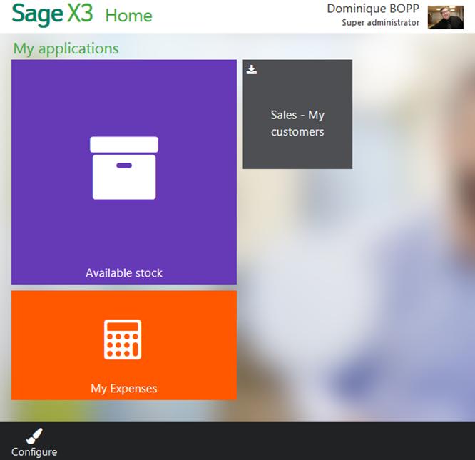
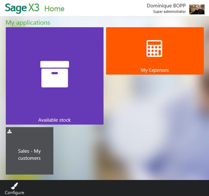
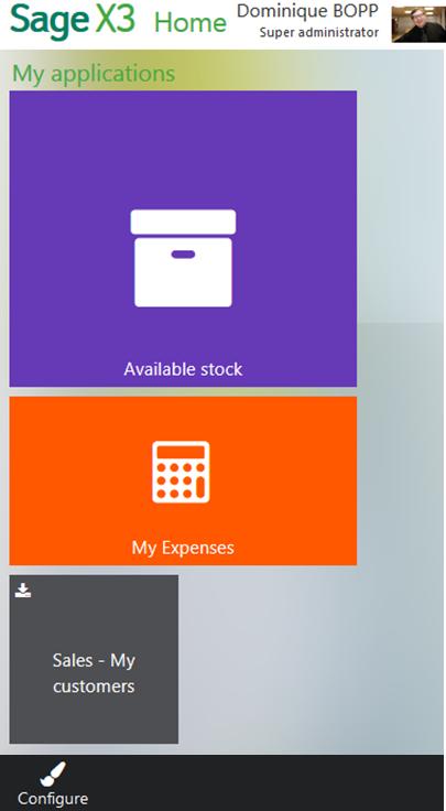
When opening the new client, the welcome page displays Tiles that give users access to different applications by tapping the icon.
While the page loads, the following animated icon displays:
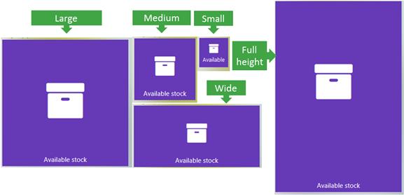
The size, text, and icons of the different applications are set up in authoring mode. The relative positions of the tiles depend on the dimensions of the device for a given setup. To illustrate this, here is a layout of three Tiles that varies based on the size of the device:
 |
 |
 |
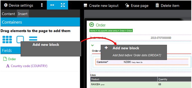
The Configure icon on the bottom of the page allows you to rearrange tiles and to add more tiles.
When you tap the Configure icon:
The page switches to design mode:
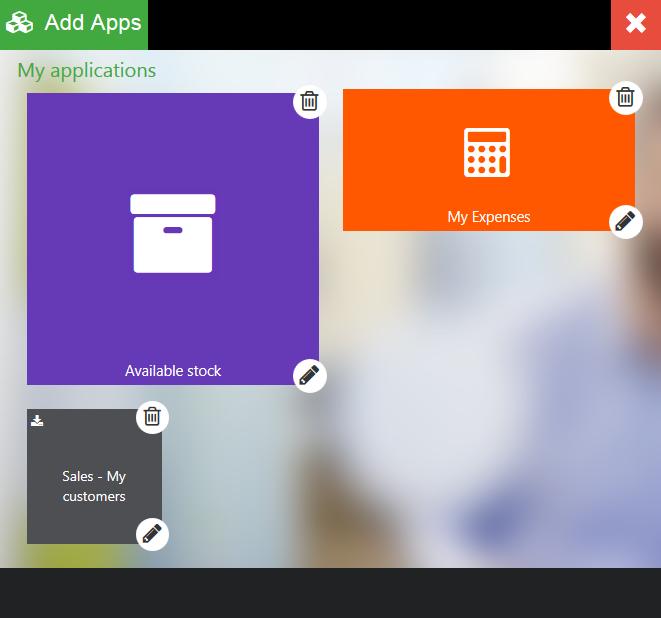
Several actions are now possible:
* Delete a Tile by tapping the trash can icon located in the upper-right corner of the tile. No confirmation is required to do this.
* Set up a tile by tapping the pen icon located in the lower-right corner of the tile.
* Add a new application by tapping the green "Add apps" icon located in the upper-left corner of the page.
* Exit design mode by tapping the red X located in the upper-right corner of the page.
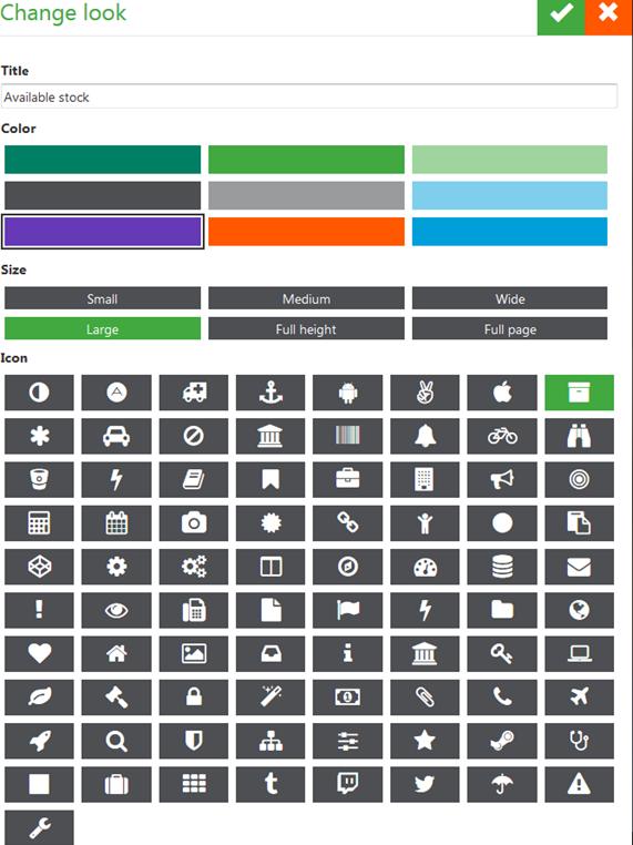
The Tile setup page allows you to change the title, color, relative size, and associated icon.
|
 |
To add an application, tap the corresponding icon and select an application from the page that opens. Currently available applications are present in the list. Tapping an application selects it; tapping again deselects it. You can select several applications. Tap the green check mark to install the selected application or applications. Tap the red X to exit this mode without adding any applications.
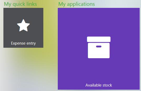
Another way to add a Tile on the main page is to bookmark pages. The bookmarked pages link displays in a different category (My quick links rather than My applications):
The procedure to do this is described here.
If a new application is available on the server, the new Tile displays with an install icon in the upper-left corner:
Tap the Tile to install the new application. If you do not want to use the application, you can delete the Tile and the application is not suggested again. You can, of course, use the Add application link to find it again in the list of available applications.
If an application is updated on the server, a small icon displays in the upper-left corner of the tile:
When you tap the tile, you are asked if you want to update the application:
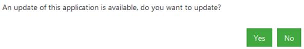
Tap Yes to install the update. The page fades out and a waiting animation displays until the update is complete (few seconds):

The updated application opens after the download is complete. The small update icon no longer displays.
If you tap No, the current version of the application launches. The small update icon remains until the next time you visit the home page.
Please note that new applications or updates on existing applications are only checked at log in. If your administrator adds a new application while you are already logged in, it will be available after you log out and log in again.
Tap the user area located in the top-right corner to open a small menu:
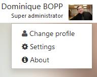
The following operations are available:
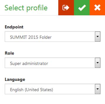
The following page opens with access to several operations:
|
|
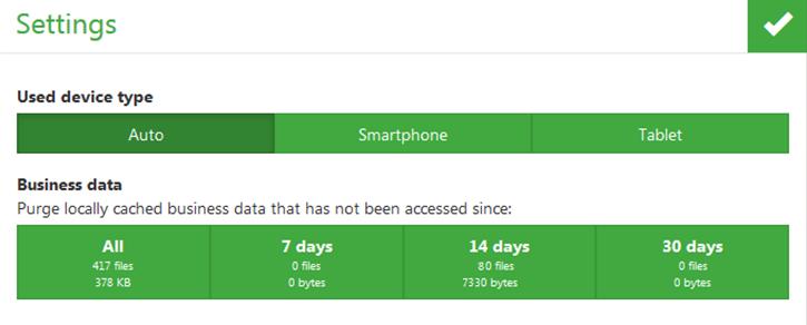
The following page opens to set up:
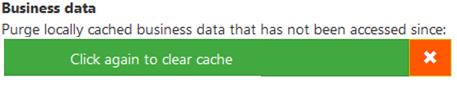
If you tap the green box again, the cache is cleared. Tap the orange X to cancel the clear cache operation. |
|
An application home page can either be a list of links or a collection of gadgets, depending on how the mobile dashboard has been designed.
The following links display:
Tap a menu item to open a gadget. A gadget is the equivalent of a V7 page. Several types are available:
* A Query page displays a list of records.
* A Details page displays a record.
* An Edit page is used to create or modify a record.
You can change the design of the page by changing the color and arrangement of the Tiles.
A home page that contains gadgets displays as follows:
Designing this type of page combines Tile arrangement and the design on a full page (depending on its type). The full design of pages is detailed for every type of facet (query, details, edit).
This section describes the Tile arrangement that is the only available for a list of menu pages.
Tapping the user panel displays the following pop-up menu:
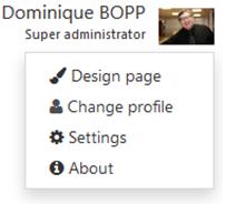
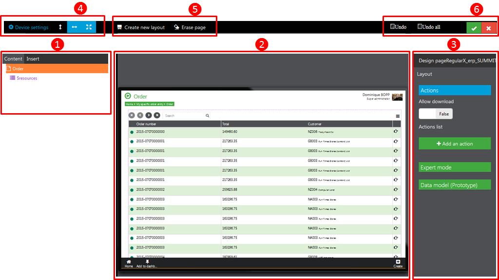
Tap Design page to open the following page:
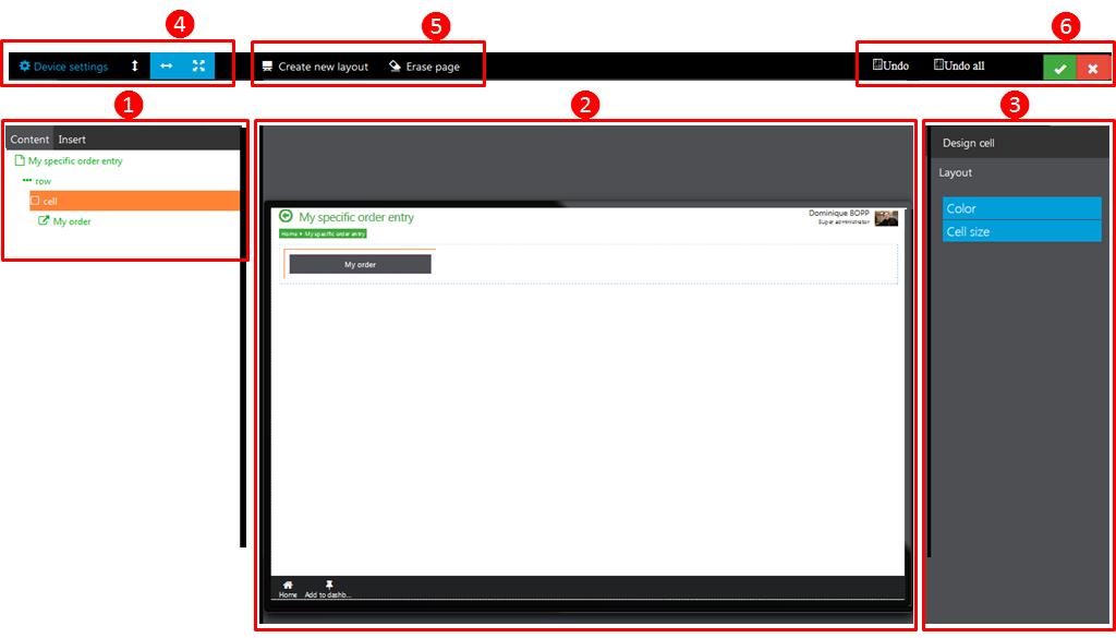
This page contains the following elements:
When designing the home page, an important design level is the Cell level. The right panel associated with it is the following:
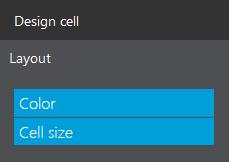
The following choices are available:
| You can select the background color of the menu item Tile: color selector displays. | 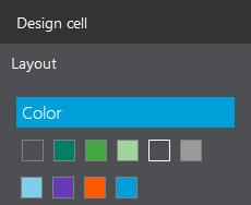 |
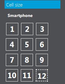
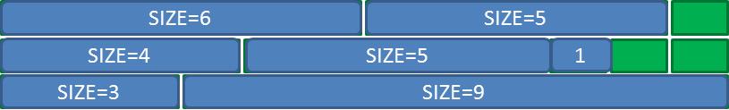
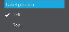
You can select the relative size and color of the menu item Tile for different device sizes (smart phone, tablet in portrait, mini-tablet in landscape, tablet in landscape) based on the following:
|
 |
 | |
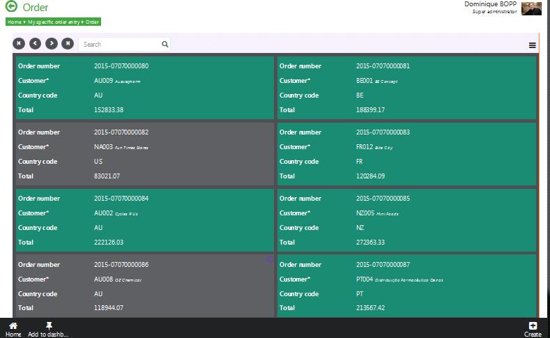
A query page can look like this:
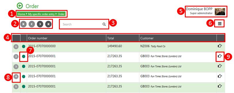
This page contains the following elements:
The design page action allows you to deactivate the different areas: they can be partially present.
When entering a text in the search box, a search is performed on the items in the list.
When tapping the Sort/filtering link, the following panel displays to sort and/or filter the query:
*Tapping Apply closes the panel and displays the query sorted and/or filtered accordingly.
*Tapping Close closes the panel without changing the previous sorting and filtering options.
By default, the sorting tab is displayed:
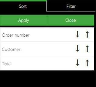
The fields present in the query are displayed, and you can tap the ascending and descending arrays to sort the list. Tapping an array a second time deactivates the sort.
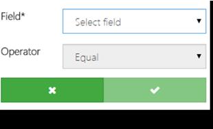
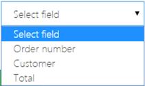
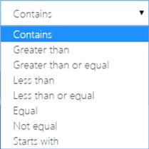
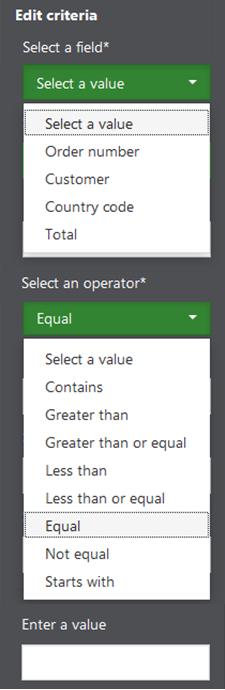
When tapping the Filter tab, the following panel displays. You can then select fields, operators, and values to create conditions applied to filter the query. For field and operator selections, dialog boxes display with the following options:
 |
 |
 |
You can then enter a value and tap the check mark to validate the filtering criterion. Several criteria can be added in a filter using the "and" operator.
By tapping the user panel, and then Design page, you display the following design page:
The same areas as for the home page design are present. Two levels of nested elements are present on the left panel. The first is associated with the query page, the second to the grid that contains the list of lines.
The right panel associated with the query page is the following:
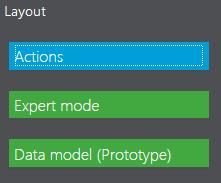
The Expert mode and the Data model (prototype) provide access to the technical structure of the document; they should not to be used except by skilled developers.
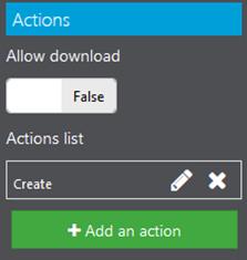
Tapping Actions displays the following choices:
The first selector indicates if a download action is available on the page and the next information on the panel is a list of actions with icons:
|
 |
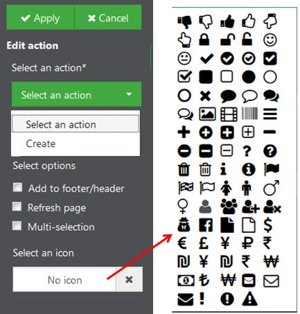
For each action link setup, the following section opens:
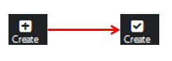
Note that some standard actions can already be present by default on the action panel, but using the action setup allows you to change the default icon. Selecting a check box icon for the Creation action changes the icon as shown here: To validate the action setup, tap Apply. Tapping Cancel exits edit mode without saving changes. |
  |
The right panel associated with the $resources tag of the query page, representing the grid in the query, is the following:
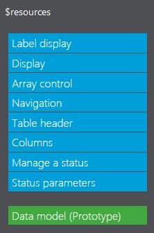
The Data model (prototype) link provides access to the technical structure of the document; it should not be used except by skilled developers.
This panel contains the following elements:
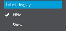 |
This option allows you to show or to hide labels. |
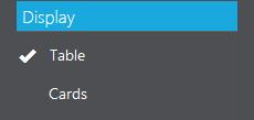 |
This option allows you to choose between two types of design: the list design or the card design. When the card design is chosen, the following options may change. The list of options given next are those available with the list design. |
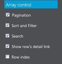 |
Select the check box to enable any of these elements for the query page:
|
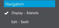 |
You can select whether a detail page or an edit page displays when tapping a line. |
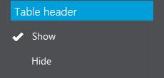 |
You can decide whether the table header is displayed or not on the page. |
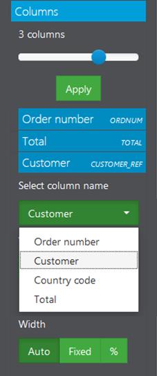 |
This section defines the number of columns in the list and the order for the selected columns. To do this:
|
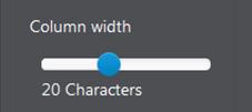 |
You can define a fixed size using a slider. |
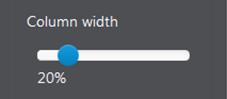 |
You can define a percentage of the total width using a slider. |
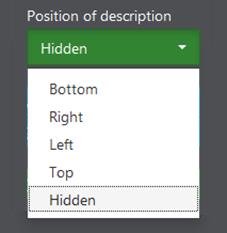 |
For the fields referring to an entity that has a description, you can define if it is hidden and its relative position compared to the field value. |
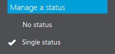 |
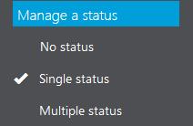
A status column can be managed based on the following principles:
|
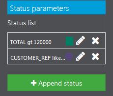 |
When the status is not set to No status, the list of conditions already entered is displayed, and you can:
|
 |
To define a condition, you need to enter:
|
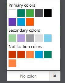 |
You can then define the color of the indicator associated with the condition. A color selector is available for this: |
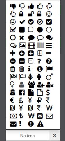 |
Finally, you can select the icon associated with the condition. An icon selector is available for this: |
 |
You can validate the conditions you have added by tapping Apply, or exit without saving the changes by tapping Cancel. |
When the card design is chosen, it displays in the central panel:
The options that can be chosen are almost the same, except for the following:
| The columns are all displayed in the order determined by the prototype and cannot be changed. | |
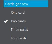 |
You can set the number of cards per row, from 1 to 4. |
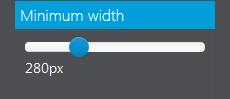 |
You can set the minimum width of a card in pixels. |
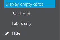 |
You can define how the empty record located at the end of an incomplete line is displayed:
|
 |
Because card view space is less limited than a line, you can choose:
|
A detail gadget page displays a record for an entity such as an order or a customer.
A detail page can have the following design:
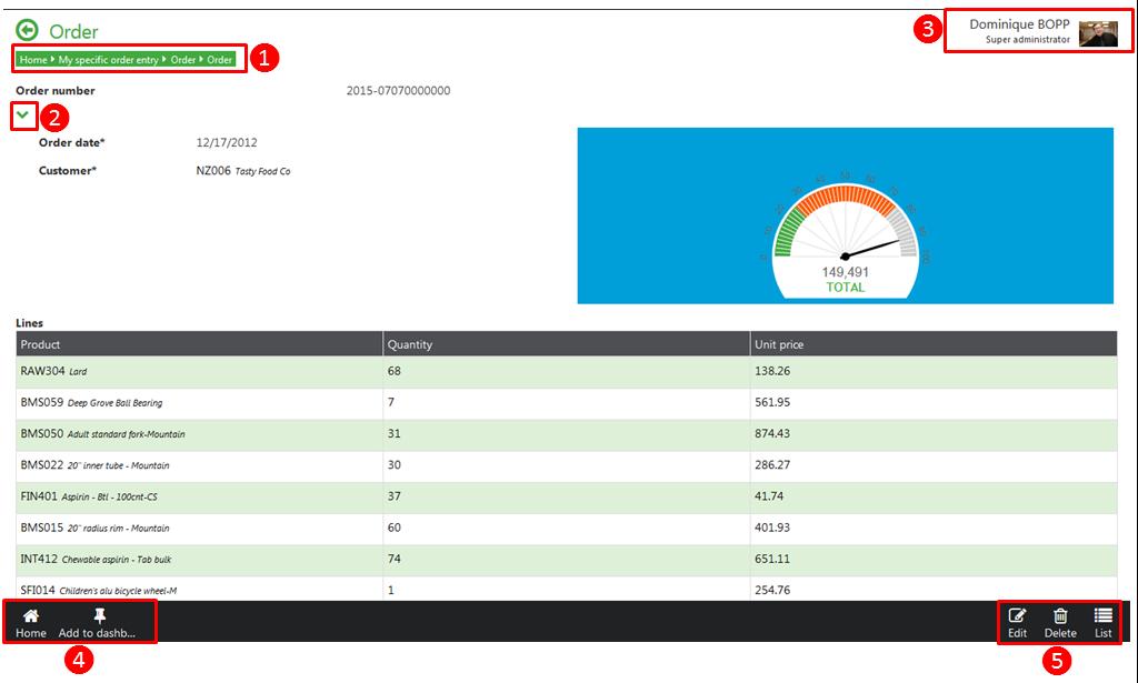
This page contains the following elements:
The design page action impacts different areas that can look differently or be absent.
By tapping the user panel, and then Design page, you display the following design page:
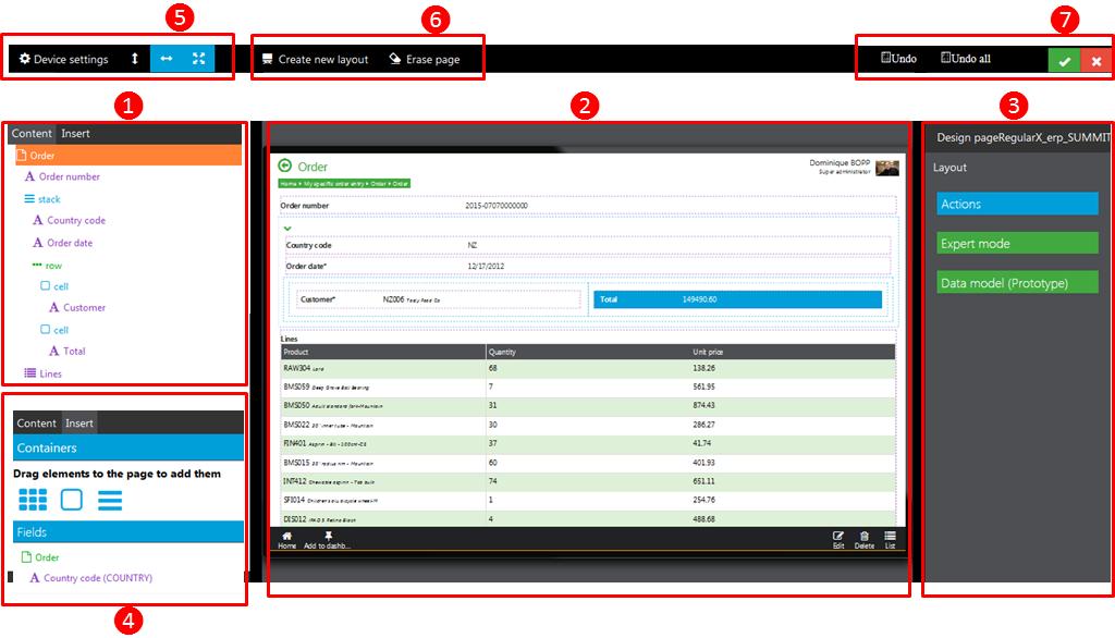
This page contains the following elements:
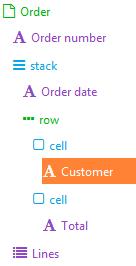
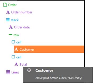
The nested structure of the document is displayed here. For the detail page, multiple levels can be nested depending on the page structure. Tapping a level displays it in orange and changes the right panel, providing access to corresponding parameters. The different levels used for a detail page are:
 |
|
You can perform the following operations from this panel:
This panel displays two sections:
On the right panel, you can change the setup for the elements located at every level. Depending on the level, this panel displays different information:
At this level, you can setup the actions, exactly as for the query page structure.
At this level, you can define the layout setup of the stack with the following information:
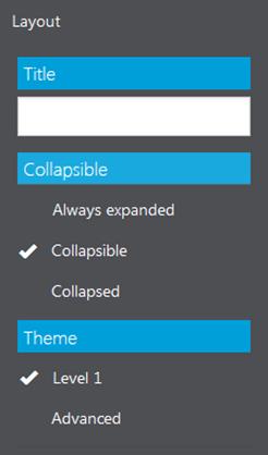 |
Assign a title
The stack can be collapsible, and if collapsible, it can be opened or collapsed by default. Select a theme from a list |
At this level, you can set up the actions, exactly as for the home page tiles design.
At this level, you can set up the characteristics of the fields present on the page by entering different values, depending on the type of the field:
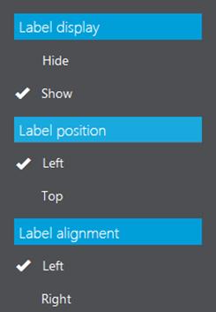 |
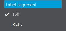
For each type of field, you can define if the title is displayed or not and how it is positioned and aligned. | ||
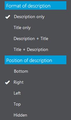 |
When the field is a reference to another entity (for example a customer code, an item reference, a country code), you can define which information linked to the corresponding record should be displayed (title, description, or both in the order you want). You also need to define its position relative to the code (it can be also hidden). | ||
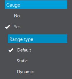 |
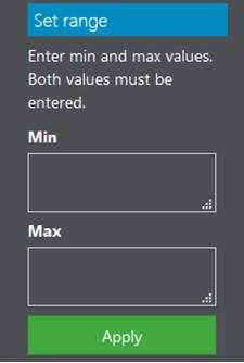
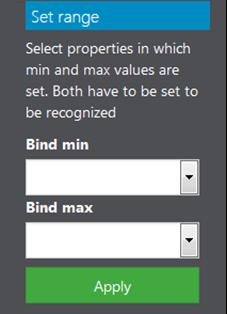
When the field is numeric, you can decide to display it as a gauge. Three types of gauges are possible: default (0-100), static (fixed range), or dynamic (two fields that must be present in the prototype are used as range). The two images below show the parameter input in both cases, which is validated by tapping Apply:
|
||
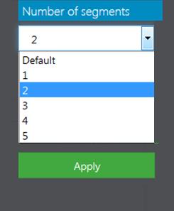 |
For a gauge, the number of segments that are displayed must be defined from 1 to 5. Tap Apply to save the values entered. | ||
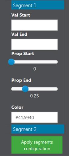 |
For each segment, you can enter:
|
 |
When the field represents a collection, the right panel displays a list of options that are almost the same as for the query display, with some exceptions:
|
An edit gadget page allows you to create or modify a record for an entity such as an order or a customer.
An edit page can have the following layout:
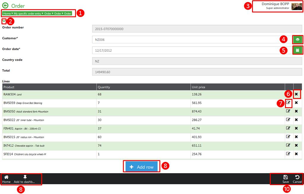
An edit page can contain the following elements:
The design options for the edit tablet are exactly the same as for the Design page.
When you are finished customizing a page, tap the global validation icon to save. The following panel opens:
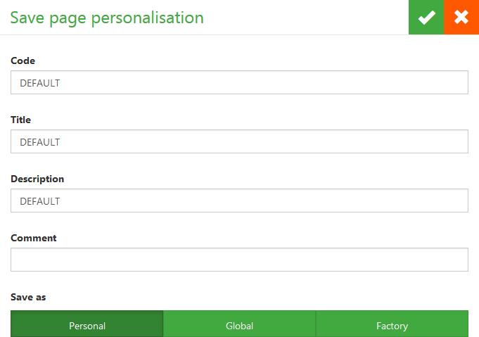
|
In this panel, you can enter a code, a title, a description, or a comment. The customization can be saved as personal, global, or factory, which assigns it to your default factory code.
 Note that this action will save the customization on the server. When you leave customization mode, you see the result. But if you reload the page later, you see the previous page, unless you update your version by using the Update version action in the mobile application definition page. Note that this action will save the customization on the server. When you leave customization mode, you see the result. But if you reload the page later, you see the previous page, unless you update your version by using the Update version action in the mobile application definition page.
|
The mobile client uses HTML5 data caching features to store local data previously used by the user. The main principles are the following:
* the page layout of every application is stored in the cache as soon as the application has been launched.
* the data associated to the pages is stored if the page has been accessed. But there is also a way to update the cache by selecting a list of records.
* the settings screen allows cleaning the cache.
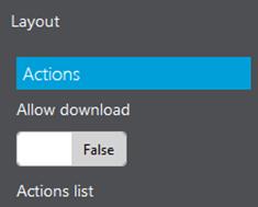
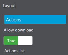
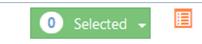
Manage cache on a page can be done by using the page personalization. In the page personalization of the query, at the document level, an Allow download selector can be swithed on or off:
 |  |
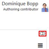
| When this switch is on, it is possible to perform multi-selection on queries. Depending on the layout(mobile or tablet), the icones are not located at the same place: | |
| For the tablet mode, the switch is located in the top right side of the screen, just under the user identification area: | For the mobile mode, it is located on the right panels that opens when clicking on the upper right chevron: |
 | 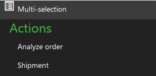 |
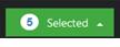
| When the multi-selection mode is activated, the user can select several records by clicking on the lines and / or the record, depending on the grid mode used. The number of record selected is displayed: | |
| on the bottom of the page in tablet mode | at the top of the page in mobile mode |
 |  |
| In both cases, the lines and / or the record can be selected, and the count of selected record is displayed.For instance, you can see here the layout of a tablet page when a multiple selection has been done in record mode: | |
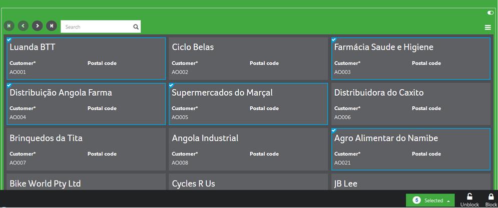 | |
On multiple selections, a popup displays different choices:
| 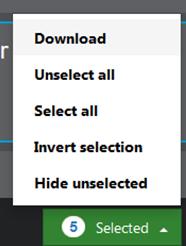 |
| The download choice allows not only to download the data associated to the details of the entity, but also to the data that can be displayed from links available on the details. Let's for instance imagine that, on a customer details, links exists to display the list of his orders, quotes, invoices, returns with various selections. Based on these links, the system will not only propose to download the selected customers, but the corresponding documents. This is defined by checking the corresponding boxes: | 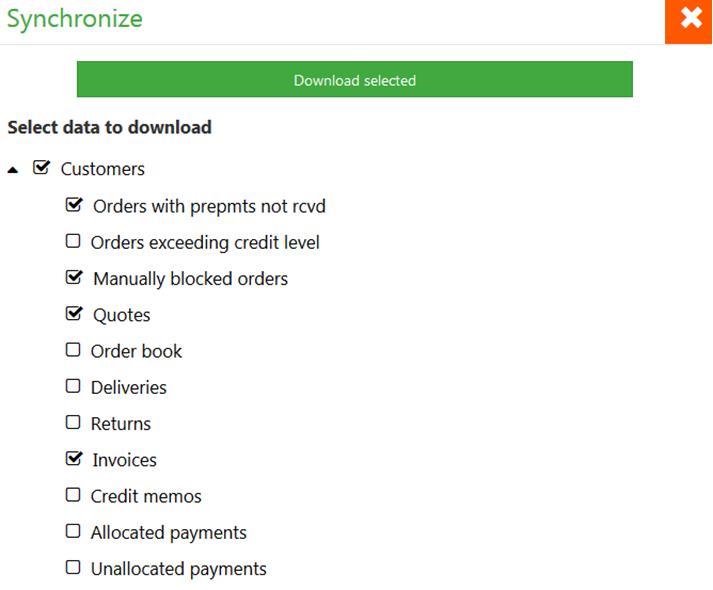 |
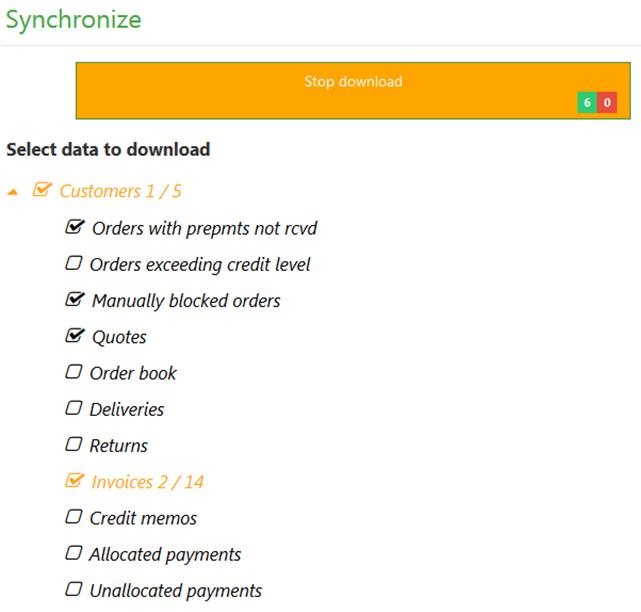
Clicking on the download button will display the following page:
|  |