Mobile desktop authoring
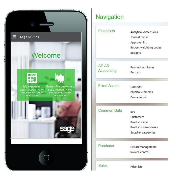
Version 7 web client is able to operate on a mobile phone using a dedicated design to the mobile web browser.
The following tool, available from the user panel, provides access to the page personalization for mobile representation.
When entering information in this mode, the page is split in two sections:
- The left section represents the mobile phone with the current installed application. You can click this section, install additional applications, or enter information on a given application.
- The right section displays the current page in desktop mode.
| When first logging on, the page displays the following: |
|
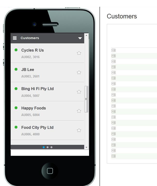
| When a query is selected, the page displays the following: |
|
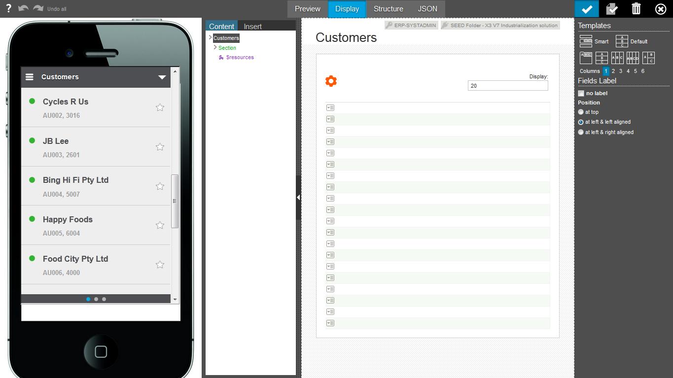
Clicking the personalization icon  displays the following page: displays the following page: |
|
|
|
| From this page, the list can be personalized. Every modification made on the right side triggers a redisplay of the mobile layout: | |
|
|
| Clicking a detail line switches to the detail page: | |
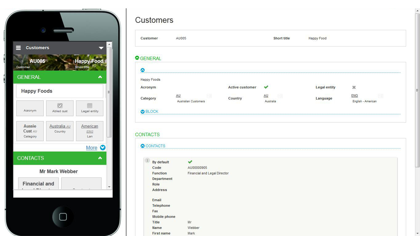
|
|
| Clicking the personalization icon displays the personalization page for detail: |
|
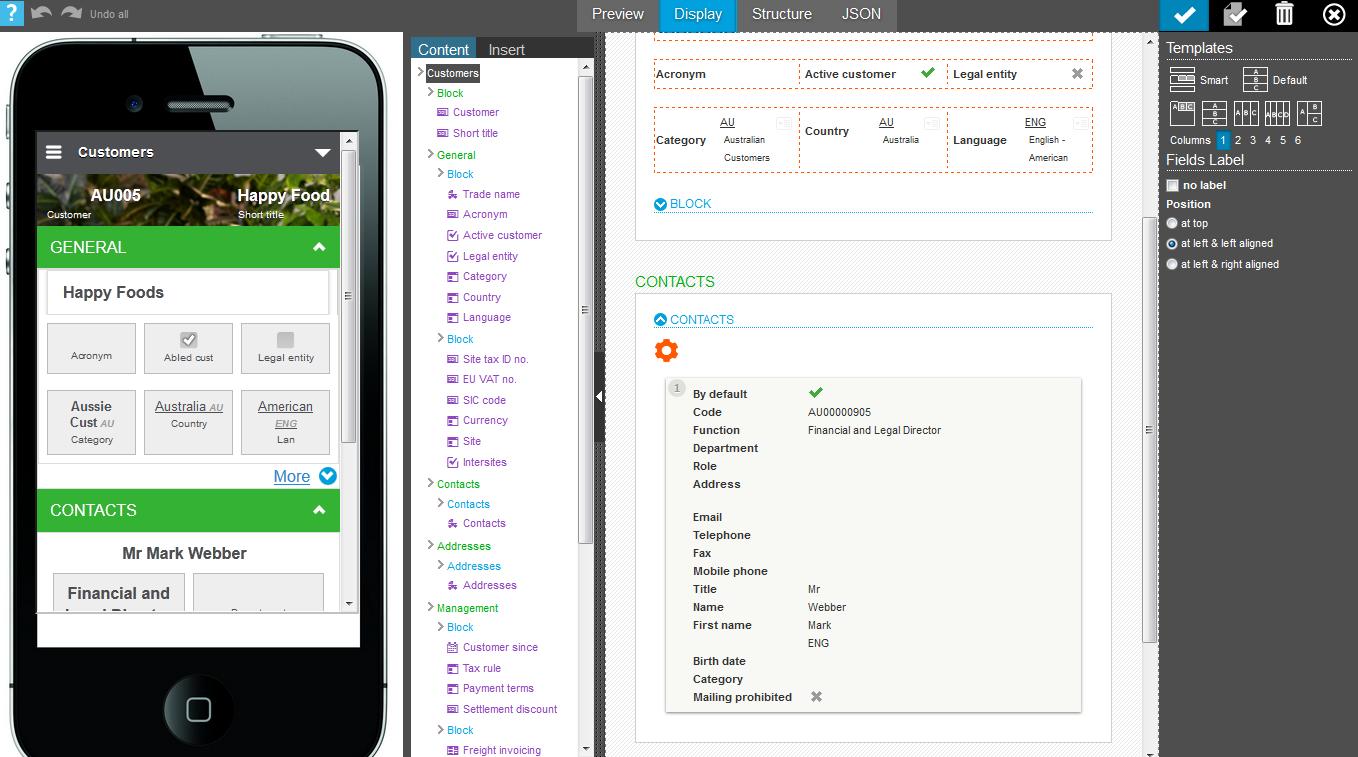
|
|
| This page can be modified and triggers the display of the modified layout on the left. | |
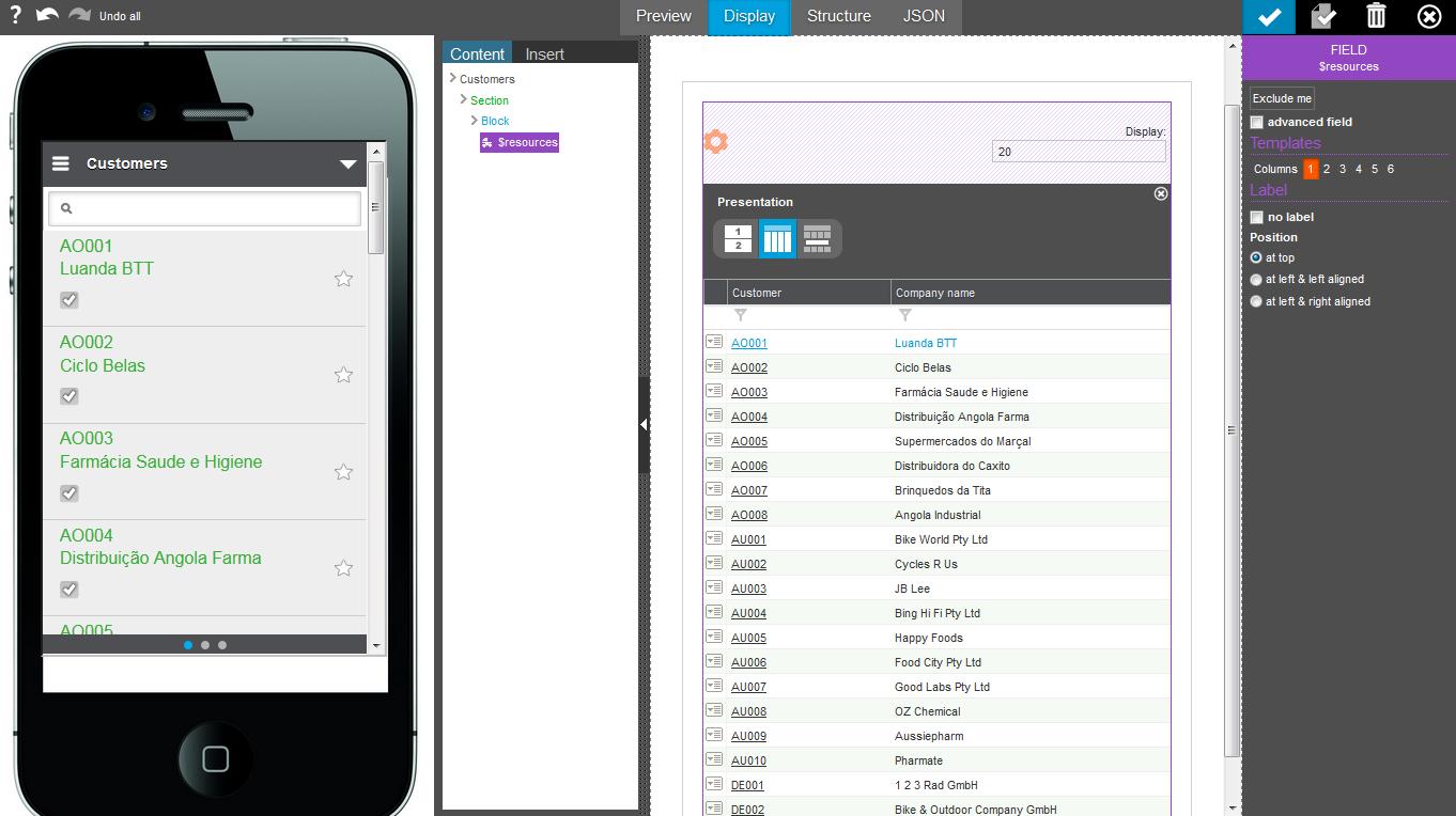
On the right panel, the same personalization tool is used as for the destktop tool, with the following differences:
- The left side displays the result of every modification made with the mobile phone layout.
- A set of four buttons (instead of three) appears at the top of the page:
- The first button displays a preview of the page.
- The second button displays the normal personalization mode (it is the choice per default).
- The third button displays the structure only (blocks and sections).
- The fourth button provides access to the JSON structure of the personalized page and must be modified only by experienced users.