UI component state verification
Text field
The following step definitions are available to control the state of a text field:
the selected text field should be enabled
the selected text field should be disabled
the text field with name: "(.*)" is displayed
the text field with name: "(.*)" is hidden
the text field with X3 field name: "(.*)" is displayed
the text field with X3 field name: "(.*)" is hidden
Examples
Extract from sample: 0314A-TextFieldStateVerification
#Text field: verification that the text field is disabled
Then the user clicks the "Identity" tab selected by title
Given the user selects the text field with name "Site"
Then the selected text field should be disabled
#Text field: verification that the text field is enabled
When the user selects the check box with name "Intersite"
Then the user clicks the selected check box
Then the selected text field should be enabled
Extract from sample: 0314A-TextFieldStateVerification.
#Text field: verify that a text field with a name is displayed
Then the text field with name: "Category" is displayed
#Text field: verify that a text field with an X3 field name (ScreenCode_FieldName) is displayed
Then the text field with X3 field name: "BPC0_BCGCOD" is displayed
#Text field: verify that a text field with a name is hidden
Then the text field with name: "Hiddenfield" is hidden
#Text field: verify that a text field with an X3 field name (ScreenCode_FieldName) is hidden
Then the text field with X3 field name: "BPC0_HDFIELD" is hidden
Date field
The following step definitions are available to control the state of a date field:
the date field with name: "(.*)" is displayed
the date field with name: "(.*)" is hidden
the date field with X3 field name: "(.*)" is displayed
the date field with X3 field name: "(.*)" is hidden
Examples
Extract from sample: 0314B-DateFieldStateVerification.
#Date field: verify that the date field with a name is displayed
Then the date field with name: "Accounting date" is displayed
#Date field: verify that the date field with an X3 field name (ScreenCode_FieldName) is displayed
Then the date field with X3 field name: "BIC0_ACCDAT" is displayed
#Date field: verify that the date field with a name is hidden
Then the date field with name: "Hiddenfield" is hidden
#Date field: verify that the date field with an X3 field name (ScreenCode_FieldName) is hidden
Then the date field with X3 field name: "BIC0_HDFIELD" is hidden
Check box field
The following step definitions are available to control the state of a checkbox field:
the selected check box is disabled
the selected check box is enabled
the check box field with name: "(.*)" is displayed
the check box field with name: "(.*)" is hidden
the check box field with X3 field name: "(.*)" is displayed
the check box field with X3 field name: "(.*)" is hidden
Examples
Extract from sample: 0314C-CheckboxFieldStateVerification
#Check box field: verifying the check box is disabled
Given the user selects the check box with name: "Miscellaneous BP"
Then the selected check box is disabled
#Check box field: verifying the check box is enabled
Given the user selects the check box with name: "Service supplier"
Then the selected check box is enabled
Extract from sample: 0314C-CheckboxFieldStateVerification.
#Checkbox field: verify that the checkbox field with a name is displayed
Then the check box field with name: "Miscellaneous BP" is displayed
#Checkbox field: verify that the checkbox field with an X3 field name (ScreenCode_FieldName) is displayed
Then the check box field with X3 field name: "BPRBPC_BPRACC" is displayed
#Checkbox field: verify that the checkbox field with a name is hidden
Then the check box field with name: "Hiddenfield" is hidden
#Checkbox field: verify that the checkbox field with an X3 field name (ScreenCode_FieldName) is hidden
Then the check box field with X3 field name: "BPRBPC_HDFIELD" is hidden
Radio button field
The following step definitions are available to control the state of a radio button field:
the radio button "(.*)" of the selected radio buttons group is disabled
the radio button "(.*)" of the selected radio buttons group is enabled
the radio buttons group with name: "(.*)" is displayed
the radio buttons group with name: "(.*)" is hidden
the radio buttons group with X3 field name: "(.*)" is displayed
the radio buttons group with X3 field name: "(.*)" is hidden
Examples
Extract from sample: 0314D-RadiobuttonFieldStateVerification.
#Radio button field: select the radio button and control its states and the value selected
Given the user selects the radio buttons group with name: "Generation type"
Then the radio button "Actual" of the selected radio buttons group is enabled
When the user clicks on "Active simulation" radio button of the selected radio buttons group
#Radio button field: verify that the radio button is deactivated
Given the user selects the radio buttons group with name: "Entry status"
Then the radio button "Temporary" of the selected radio buttons group is disabled
Extract from sample: 0314D-RadiobuttonFieldStateVerification.
#Radio button field: verify that the radio button field with a name is displayed
Then the radio buttons group with name: "Generation type" is displayed
#Radio button field: verify that the radio button field with an X3 field name (ScreenCode_FieldName) is displayed
Then the radio buttons group with X3 field name: "CPTSVC_TYP" is displayed
#Radio button field: verify that the radio button field with a name is hidden
Then the radio buttons group with name: "Hiddenfield" is hidden
#Radio button field: verify that the radio button field with an X3 field name (ScreenCode_FieldName) is hidden
Then the radio buttons group with X3 field name: "CPTSVC_HDFIELD" is hidden
Drop-down list field
The following step definitions are available to control the state of a drop-down list field:
the drop down list with name: "(.*)" is displayed
the drop down list with name: "(.*)" is hidden
the drop down list with X3 field name: "(.*)" is displayed
the drop down list with X3 field name: "(.*)" is hidden
the "(.*)" value of the selected drop down list is displayed
the "(.*)" value of the selected drop down list is hidden
Examples
Extract from sample: 0314E-DropdownListFieldStateVerification.
#Drop-down list field: verify that the drop-down list field with a name is displayed
Then the drop down list with name: "Product status" is displayed
#Drop-down list field: verify that the drop-down list field with an X3 field name (ScreenCode_FieldName) is displayed
Then the drop down list with X3 field name: "ITM0_ITMSTA" is displayed
#Drop-down list field: verify that the drop-down list field with a name is hidden
Then the drop down list with name: "Hiddenfield" is hidden
#Drop-down list field: verify that the drop-down list field with an X3 field name (ScreenCode_FieldName) is hidden
Then the drop down list with X3 field name: "ITM0_HDFIELD" is hidden
Extract from sample: 0314E-DropdownListFieldStateVerification.

#Drop-down list field: verify that the value of the selected drop-down list is displayed or hidden
And the user selects the drop down list with name: "Suggestion type"
Then the "No suggestion" value of the selected drop down list is displayed
Then the "Purchase" value of the selected drop down list is displayed
Then the "Manufacturing" value of the selected drop down list is hidden
Then the "Intersite" value of the selected drop down list is displayed
Icon field
The following step definitions are available to control the state of an icon field:
the icon field with name: "(.*)" is displayed
the icon field with name: "(.*)" is hidden
the icon field with X3 field name: "(.*)" is displayed
the icon field with X3 field name: "(.*)" is hidden
Examples
Extract from sample: 0314F-IconFieldStateVerification.
#Icon field: verify that the icon field with a name is displayed
Then the icon field with name: "PLM history" is displayed
#Icon field: verify that the icon field with an X3 field name (ScreenCode_FieldName) is displayed
Then the icon field with X3 field name: "ITM1_BUTHISURL" is displayed
#Icon field: verify that the icon field with a name is hidden
Then the icon field with name: "Hiddenfield" is hidden
#Icon field: verify that the icon field with an X3 field name (ScreenCode_FieldName) is hidden
Then the icon field with X3 field name: "ITM1_HDFIELD" is hidden
Link field
The following step definitions are available to control the state of a link field:
the link field with name: "(.*)" is displayed
the link field with name: "(.*)" is hidden
Examples
Extract from sample: 0314G-LinkFieldStateVerification.
#Link field: verify that the link field with a name is displayed
Then the link field with name: "Country" is displayed
#Link field: verify that the link field with a name is hidden
Then the link field with name: "Hiddenfield" is hidden
Text area field
The following step definitions are available to control the state of a text area field:
the text field with X3 field name: "(.*)" is displayed
the text field with X3 field name: "(.*)" is hidden
Extract from sample: 0314H-TextAreaFieldStateVerification.
#Text area field: verify that the text area field with anX3 field name (ScreenCode_FieldName) is displayed
Then the text field with X3 field name: "PJMEVEN_COMMEVEN" is displayed
#Text area field: verify that the text area field with an X3 field name (ScreenCode_FieldName) is hidden
Then the text field with X3 field name: "PJMEVEN_HDFIELD" is hidden
Text editor field
The following step definitions are available to control the state of text editor fields using RTF or CKEditor 5 components:
the text editor field of section: "(.*)" is displayed
the text editor field of section: "(.*)" is hidden
the text editor field with X3 field name: "(.*)" is displayed
the text editor field with X3 field name: "(.*)" is hidden
Extract from sample: 0314I-TextEditorFieldStateVerification.
#Text editor field: verify that the text editor field of a section is displayed
Then the text editor field of section: "Header text" is displayed
#Text editor field: verify that the text editor field with an X3 field name (ScreenCode_FieldName) is displayed
Then the text editor field with X3 field name: "FPT1_TXT2" is displayed
#Text editor field: verify that the text editor field of a section is hidden
Then the text editor field of section: "Hiddenfield" is hidden
#Text editor field: verify that the text editor field with an X3 field name (ScreenCode_FieldName) is hidden
Then the text editor field with X3 field name: "FPT1_HDFIELD" is hidden
Password field
The following step definitions are available to control the state of a password field:
the password field with name: "(.*)" is displayed
the password field with name: "(.*)" is hidden
Extract from sample: 0314J-PasswordFieldStateVerification.
#Password field: verify that the password field is displayed
Then the password field with name: "New password" is displayed
#Password field: verify that the password field is hidden
Then the password field with name: "Hiddenfield" is hidden
Data table
The following step definitions are available to control the state of a data table cell:
the selected cell is enabled
the selected cell is disabled
the user selects the disabled cell with column header: "(.*)" and row number: (.*)
The following step definitions are available to control the state of a data table column header:
the column header with name "(.*)" of the selected data table is displayed
the column header with name "(.*)" of the selected data table is hidden
the column header with X3 field name "(.*)" of the selected data table is displayed
the column header with X3 field name "(.*)" of the selected data table is hidden
the "(.*)" choice of the selected cell is displayed
the "(.*)" choice of the selected cell is hidden
the "(.*)" function on the toolbox of the selected row is (displayed|hidden)
the image in the selected cell is defined
the image in the selected cell is undefined
Examples
Extract from sample: 0314K-DataTableCellStateVerification.
#Data table: select data table of the required section
Given the user selects the data table of section: "Variance accounts"
#Data table: check the selected cell is disabled
When the user selects cell with column header: "Account" and row number: "2"
Then the selected cell is disabled
#Data table: check the selected cell is enabled
When the user selects cell with column header: "Account" and row number: "7"
Then the selected cell is enabled
#Data table: select a disabled cell
When the user selects the disabled cell with column header: "Account" and row number: "2"
Extract from sample: 0314K-DataTableCellStateVerification.
And the user selects the fixed data table for X3 field name: "WMAC2STDSP_ARRAY_NBLIG"
#Fixed part of the data table
#Data table - Verify that the column header with a name is displayed
Then the column header with name "Site" of the selected data table is displayed
#Data table - Verify that the column header with an X3 field name is displayed
Then the column header with X3 field name "WMAC2STDSP_FCYLIN" of the selected data table is displayed
#Data table - Verify that the column header with a name is hidden
Then the column header with name "Ctrl." of the selected data table is hidden
#Data table - Verify that the column header with an X3 field name is hidden
Then the column header with X3 field name "WMAC2STDSP_SAC1" of the selected data table is hidden
#None-fixed part of the data table
#Data table - Verify that the column header with a name is displayed
Then the column header with name "BP" of the selected data table is displayed
#Data table - Verify that the column header with an X3 field name is displayed
Then the column header with X3 field name "WMAC2STDSP_BPR" of the selected data table is displayed
#Data table - Verify that the column header with a name is hidden
Then the column header with name "Tax" of the selected data table is hidden
#Data table - Verify that the column header with an X3 field name is hidden
Then the column header with X3 field name "WMAC2STDSP_TAX" of the selected data table is hidden
Extract from sample: 0314K-DataTableCellStateVerification.
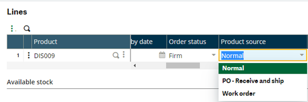
#Set sales order lines information
And the user selects the fixed data table of section: "Lines"
#Data table: verify that the value of the choice of the selected cell is displayed or hidden
And the user selects last editable cell with column header: "Product source"
Then the "Normal" choice of the selected cell is displayed
Then the "PO - Receive and ship" choice of the selected cell is displayed
Then the "Work order" choice of the selected cell is displayed
Then the "PO - Direct to customer" choice of the selected cell is hidden
Extract from sample: 0314K-DataTableCellStateVerification.
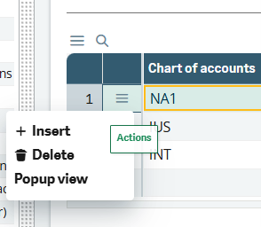
#Data table - Verify if the dropdown action (function on the toolbox) of the selected row is displayed or hidden
And the user selects fixed data table for the X3 field name: "GC01_ARRAY_NBRCOA"
And the user selects fixed table row number: 1
Then the "Insert" function on the toolbox of the selected row is displayed
Then the "Delete" function on the toolbox of the selected row is displayed
Then the "NOT EXISTING" function on the toolbox of the selected row is hidden
Extract from sample: 0314K-DataTableCellStateVerification.
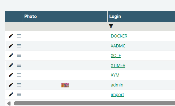
#Data table - Control if an image is defined or undefined in the data table cell
When the user selects the main data table of the page
And the user selects the row that has the text "admin" in the column with header: "Login"
And the user selects the cell with header: "Photo" in the selected row
And the image in the selected cell is defined
And the user selects the row that has the text "XATP" in the column with header: "Login"
And the user selects the cell with header: "Photo" in the selected row
And the image in the selected cell is undefined
Tab
The following step definitions are available to control the state of a tab:
the tab with title "(.*)" is displayed
the tab with title "(.*)" is hidden
Extract from sample: 0314L-TabStateVerification.

#Tab: Check if the tab with a title is displayed
Then the tab with title "Main" is displayed
#Tab: Check if the tab with a title is hidden
Then the tab with title "Concession" is hidden
Function and entity
The following step definitions are available to control the state of a function or entity in the site map:
the function "(.*)" in the site map is displayed
the function "(.*)" in the site map is hidden
the entity "(.*)" in the site map is displayed
the entity "(.*)" in the site map is hidden
Extract from sample: 0314M-FunctionEntityStateVerification.
#Function: check if a function is displayed using its function code
Then the function "GESSOH" in the site map is displayed
Then the function "BSIIMP" in the site map is displayed
#Function: check if a function is hidden using its function code
Then the function "YHDFCT" in the site map is hidden
#Entity: check if an entity is displayed
Then the entity "Bank transactions management" in the site map is displayed
#Entity: check if an entity is hidden
Then the entity "HiddenEntity" in the site map is hidden
Right panel
Main actions
The following step definitions are available to control the state of the right panel's main actions:
the "(.*)" main action button on the right panel is disabled
the "(.*)" main action button on the right panel is enabled
Extract from sample: 0314N-RightPanelMainActionStateVerification.
#Right panel action: example to enter in creation mode
Given the user clicks the "New" main action button on the right panel
#Right panel action: check if the main action is enabled
Then the "Create" main action button on the right panel is enabled
#Right panel action: check if the main action is disabled
Then the "Save" main action button on the right panel is disabled
Secondary actions
The following step definitions are available to control the state of the right panel's secondary actions:
the "(.*)" secondary action button is disabled
the "(.*)" secondary action button is enabled
Extract from sample: 0314O-RightPanelSecondaryActionStateVerification.
#Right panel action: check if the secondary action is enabled
Given the "Post" secondary action button is enabled
#Right panel action: click on the secondary action
When the user clicks the "Post" secondary action button on the right panel
And the user clicks the "Yes" option in the alert box
#Right panel action: check if the secondary action is disabled
Then the "Post" secondary action button is disabled
Header drop-down
The following step definitions are available to control the state of the right panel header drop-down's actions:
the "(.*)" action button on the header drop down is disabled
the "(.*)" action button on the header drop down is enabled
Extract from sample: 0314P-RightPanelHeaderDropdownStateVerification.
#Right panel action: open the header drop-down
Given the user opens the header drop down
#Right panel action: open the required section of the header drop-down
When the user opens the "Zooms" section on the right panel
#Right panel action: check if the action of the header drop-down is enabled
Then the "Accounting document" action button on the header drop down is enabled
#Right panel action: check if the action of the header drop-down is disabled
Then the "Withholdings on payment" action button on the header drop down is disabled
Left panel
Left list
The following step definition is available to control the state of the left list and to check if it is empty:
the selected data table of the left panel is empty
Extract from sample: 0314Q-LeftPanelStateVerification.
#Left panel: check if the data table of the left panel is empty
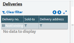
Given the user clicks the "Deliveries" link on the left panel
When the user selects the data table of left panel
And the user selects search cell with header: "Delivery no."
And the user adds the text "NotExistingValue" in selected cell and hits enter key
Then the selected data table of the left panel is empty
Picking list
The following step definition is available to control the state of the picking list and to check if it is empty:
the selected picking list of the left panel is empty
Examples
Extract from sample: 0314R-PickingListStateVerification.

#Left panel: check if the data table picking list of the left panel is empty
Given the user clicks the "Pick ticket selection" link on the left panel
When the user selects the data table of left panel
And the user selects search cell with header: "Pick ticket"
And the user adds the text "NotExistingValue" in selected cell and hits enter key
Then the selected data table of the left panel is empty
Extract from sample: 0314R-PickingListStateVerification.
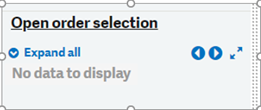
#Left panel: check if the hierarchical picking list of the left panel is empty
Given the user clicks the "Order selection" link on the left panel
When the user selects the main picking list panel of the screen
Then the selected picking list of the left panel is empty
Quick selection
Examples
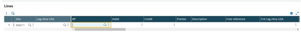
Extract from sample: 0314S-QuickSelectionStateVerification.
#Quick selection: Open the text field's quick selection
When the user clicks the "Selection" button of the selected text field
#Quick selection: Search for the required value and check if the value exists
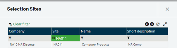
And the user selects the data table in the popup
And the user selects search cell with header: "Site"
And the user adds the text "NA011" in selected cell and hits enter key
And the user selects cell that matches exact with the text: "NA011" and column header: "Site"
Then the value of the selected cell is "NA011"
Alternatively, this solution is possible too:
And the user selects cell with column header: "Site" and row number: 1
Then the value of the selected cell is "NA011"
Extract from sample: 0314S-QuickSelectionStateVerification.
And the user selects the text field with name: "Site"
#Quick selection: open the text field's quick selection
When the user clicks the "Selection" button of the selected text field
#Quick selection: search for the required value that shouldn't be found
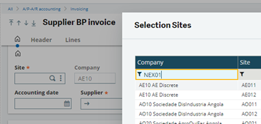
And the user selects the data table in the popup
And the user selects search cell with header: "Site"
When the user adds the text "NEX01" in selected cell and hits enter key
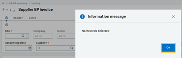
#Check that the required value is not found
Then an alert box with the text containing "No Records Selected" appears
And the user clicks the "Ok" option in the alert box