User experience
Functionalities delivered in 2020
You will see that the Visual Process Design area was changed slightly.
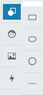
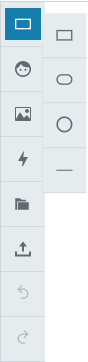
The main toolbar on the left side of the editor contains two options namely Shapes, Icon gallery, Upload image, Actions, Import, Export, Undo, and Redo.
Shapes
This option is used to create new shapes. You can select one of the following options:
-
Rectangle
-
Ellipse
-
Circle
-
Line
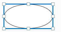
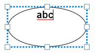
Once you have created a shape, a cursor displays that will allow you to enter text in the shape. You can move and enlarge a shape by sliding the handles present on the shapes.
Example of a line with various styles and arrow styles, an ellipse, and a rectangle with the shape menu bar:
|
|
|
|---|
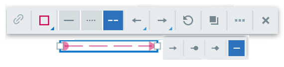
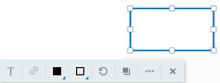
When you select a shape, a floating menu bar will display so you can manage the following:
-
Text format
-
Hyperlinks
-
Fill color
-
Border styles and colors
-
Line and arrow styles
-
Rotation
-
Duplication of the shape
-
Additional functions
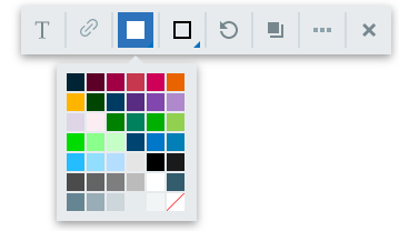
Fill color
Border styles and colors
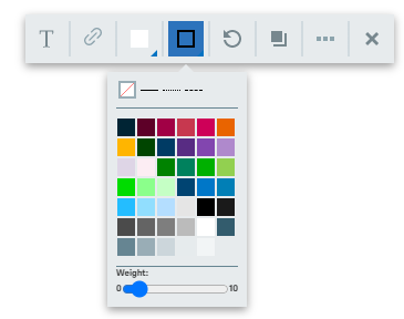
To ensure the consistency of visual processes, and reduce the burden of managing color shades, a palette of 42 colors is available.
Rotation

Rotating shapes and lines has been simplified to enhance the consistency of visual processes and avoid layout issues. You can rotate the shapes by 45-degree increments.
Enter text into a shape
Double-click the shape to enter text into it. Press Enter or click away from the shape to save your input.
Text formatting options
Click on the text format icon to open the text formatting toolbar. There you can select the:
-
Relative size (S to XXL)
-
Italic, bold, or underlined attribute
-
Horizontal or vertical justification
-
Color


Duplicate icon
You can duplicate any element when you click on this icon. The copy is placed close to the original and can be moved by drag and drop.

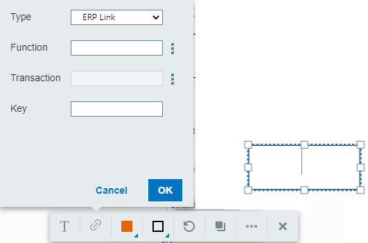
Adding a hyperlink
You can associate a unique hyperlink with a shape.
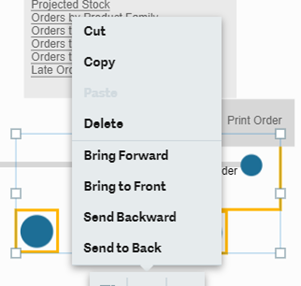
Additional functions
You can access additional shape functionalities by clicking on the ellipse (…) in the menu bar, or by right-clicking on a shape or the canvas.
Functionalities include:
-
Delete
-
Copy
-
Cut
-
Paste
-
Move a shape backwards or forwards
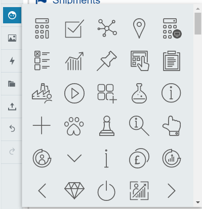
Icon gallery
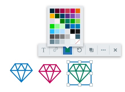
You can select from a list of icons, which are in SVG format. Icons can be resized or their color changed, once they are added to the process. You can use any color available in the palette.
Example of an icon with different colors:
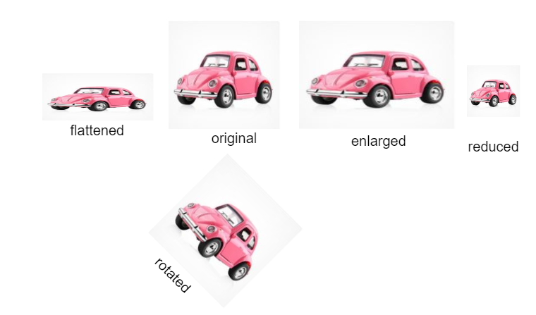
Upload images

You can include an image file. When you click on the picture icon, an explorer window will display. You can duplicate, distort, reduce, enlarge, and rotate an image:
Actions
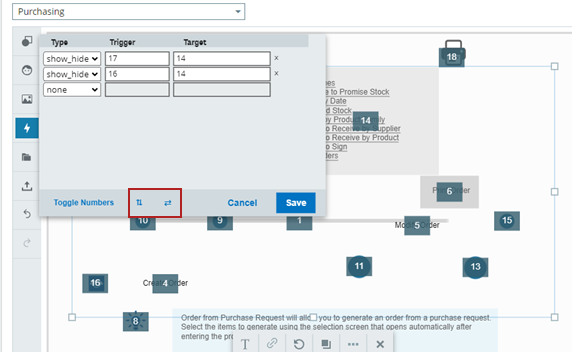
You can define show and hide actions when you click on the Action icon. Only show and hide actions are allowed. Each line defines:
-
The trigger shapes, which cause the action to happen.
-
The target shapes, which are hidden or shown by the action.
Shape numbers are displayed for you to use in defining the actions.
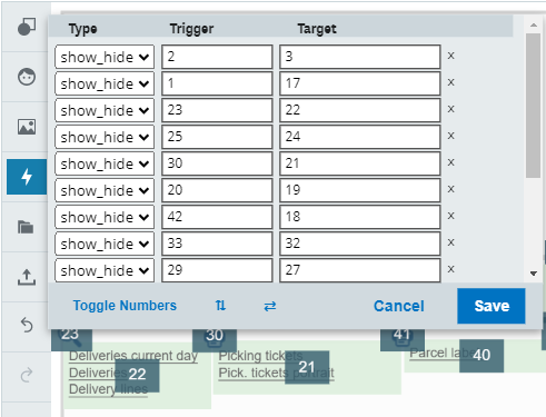
You can toggle the shape numbers on or off by clicking Toggle Numbers. Use the arrow icons to move the action panel around the canvas.
Import and export

To allow for the transfer of a visual process from one server to another, or from one folder to another you can:
-
Export a JSON file containing the visual process description to the download directory of your computer. The name of the JSON file is the name of the visual process followed by the date and hour of creation.
-
Import a JSON file containing a visual process description.
Undo and redo

You can undo or redo up to 20 actions, such as, changing colors, duplicating, moving, inserting an element, and so on.
Keyboard shortcuts
The following keyboard shortcuts are available:
| Shortcut | Description |
|---|---|
| Arrows | Move selected elements by 1 pixel in the direction of the arrow |
| Shift+Arrows | Move selected elements by 10 pixels in the direction of the arrow |
| Delete | Delete selected elements or selected text |
| Ctrl+C | Copy selected elements or text to the system clipboard |
| Ctrl+V | Paste from the system clipboard. If the clipboard data is not valid in the current context, then an error message displays. |
| Ctrl+X | Cut selected shapes or text |
| Ctrl+Z | Undo the last user action |
| Ctrl+Y | Redo the last user action |
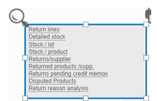
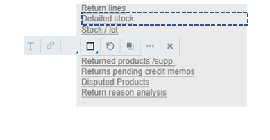
Automatic transformation of boxes with multiple links
With the new visual process editor, a box can only have one hyperlink. In the Sage X3 2020 R3 release, multiple links on a box were lost when the box was edited. This was resolved in the Sage X3 2020 R4 release, and the behavior is as follows:
|
Feature |
|
|---|---|
|
You can move or resize an existing shape that contains multiple links without triggering the automatic transformation. The shape will remain unchanged and multiple links will be retained. If you double-click to edit the shape it will then transform. |
|
|
When you double-click on a shape created with an older version of Sage X3, it will trigger a transformation of the shape, and the text become separate items. You now have a transparent box for every line, containing a single link, and an underlying grey shape without links. |
|
|
You can exit from the edit mode and you will keep the same layout and underlined links. The font can slightly change, as Sage uses standardized fonts from the style sheet. |
|
Detailed list of changes
The table below details the changes in functionality. Some features available in earlier versions are no longer available and the behavior of some features has changed.
|
Feature |
Status |
Comment |
|---|---|---|
|
Advanced animated .gif pictures, for example clocks |
Not supported |
|
|
Advanced colors and options |
Not supported |
This includes opacity, frames, and pattern filling. |
|
Change shape fill and outline |
Changed |
To ensure consistency across visual processes, a pallet of 42 colors is available for both lines and shape fill. A range of line styles, plain, dashes, and arrows are also available. The colors are defined in the style sheet and are not currently modifiable. |
|
Copy/paste features |
Available |
This is also a duplication action. |
|
Create hyperlinks on shapes |
Available |
Same as the previous editor. |
|
Create hyperlinks on text portions |
Changed |
Rather than creating multiple links inside a shape, edit a block with multiple links which will transform into multiple blocks with one link. For more information please refer to the section Automatic transformation of boxes with multiple links. |
|
Custom image upload |
Available |
The ability to upload custom images is available. Existing custom images on processes created in earlier versions will not display in the 2020 R3 release. |
|
Editing .svg icons |
Available |
You can change the color, size, and orientation of existing SVGs in the icon gallery. The mirroring option is not available. |
|
Grouping of entities |
Available |
Since release 2021 R4/V12.0.28. |
|
History of updates (undo/redo) |
Available |
In editing mode only, to allow you to redo or undo during the editing process. |
|
Keyboard shortcuts |
Available |
Copy, paste, and other classic shortcuts. |
|
Manage bezier curves |
Not supported |
This feature is deprecated. |
|
Icon set |
Available |
The image resources are managed in a better way than before. A new set of branded icons have been selected. These icons are all based on SVG files, which will allow you to change their color. The previous images will not be available anymore in new processes, but can still be displayed. |
|
Manage layers |
Available |
This feature allows you to bring objects forward or to send them backwards. |
|
Manage text styles |
Available |
Only relative size, bold, italic, and underline features are available based on a standard style sheet. |
|
Manage texts in shapes |
Available |
You can align text horizontally and vertically in a shape. |
|
Read existing visual processes and display them in the new editor |
Available |
The format of visual processes has not changed. The new version of the editor does not allow for the editing of some elements that may be included, even if they can still be displayed. |
|
Support of simple shapes |
Available |
The number of shapes has been reduced to circles, ellipses, rectangles, and lines. You can use the icon library for additional shapes. |
|
Import/export of processes |
Available |
|
|
Page size |
Available |
The size of the visual process adapts automatically to the elements that have been included. |
|
Arrow styles for lines |
Available |
|
Enhancements delivered in release 2021 R4/V12.0.28
Alignment guidelines
When moving an element, vertical and horizontal dotted guidelines appear to allow aligning the moving element with others. It can be:
-
A centering line
-
A left border alignment
-
A right border alignment
| Image | Description |
|---|---|
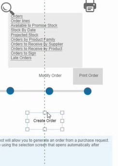
|
Centering vertical line between the moving Create Order element and the grey box above. |
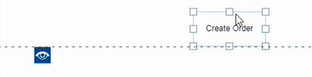
|
Aligning horizontal line between the bottom of the moving Create Order element and top of the eye icon below. |
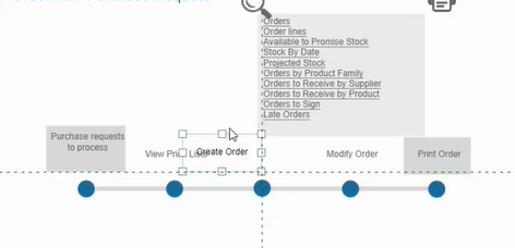
|
Two alignment lines for the moving Create order element:
|
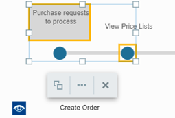
Selecting multiple elements
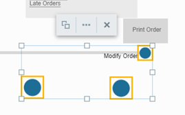
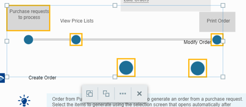
You can select several elements of a visual process. Click the first element to select it. Then press the Shift key and click again on another item to select both elements together. You can extend this selection by repeating the process. A frame appears with every selected object in a yellow box.
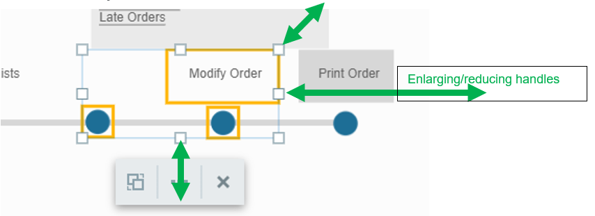
Multiple elements selected can be moved together, deleted, copied, pasted, and duplicated. You can change their size with the handles presented as indicated by the green arrows above. An action box is attached to the group, and clicking the three dots icon allows you to apply additional actions to the group.
Click the first icon of the action box to create a group that will be stored permanently.

Clicking one of the elements selects the whole group. The first icon on the action bar changes: click it to cancel the grouping.

Groups are hierarchical. You can group two groups together. They will behave as a unique group, but you can decompose them again into two groups. In the example below, two groups are selected, and you can see the two Group/Ungroup icons.
| Image | Description |
|---|---|
|
First group selected independently. |
|
Second group selected independently. |
|
Both groups selected together. |
When both groups are selected together, the two icons appear. Click the Group icon to create a new group that groups all the selected elements.
If you select the Ungroup icon for a group that was created by grouping two groups, you will get your two initial groups again.
Groups created in visual processes that used the previous flash editor are recognized as a group by the new editor.
Using the arrow keys to move
Use the up, down, right, and left arrow keys on a selected element or group to move them by one pixel. If you press the Shift key simultaneously, the move is done by an increment of 10 pixels.
Entering text in a shape
You no longer need to press the Enter key after entering text in a shape to save the text. Moving to another shape will keep the text validated inside the shape.
Copy and paste actions
Copy and paste are now using the system clipboard. You can copy and paste across browsers and from a visual process to another.
Links and underline
When you create a text in a box that has a hyperlink, the text is no longer underlined by default. You can apply the underline attribute independently like before.

Actions panel
When the action panel appears, you can display the group or element numbers. You can move the panel by using the arrow icons to see the groups or items that are hidden under it.