Mobile client - Basic user interface
Accessing the new interface
When a user connects to a Sage X3 site in product update 9, the user preference panel shows various links.
The link Mobile home page provides access to the new product update 9 mobile/tablet client. For compatibility reasons, the link to the (Tablet home page (V7)) is still available.
The primary access URL is different for each UI and reflected in the list below:
| User interface | URL |
|---|---|
| Desktop UI | http://my_server:service/syracuse-main/html/main.html?url=%3Frepresentation%3Dhome.%24landing
|
| Tablet adapted pages (V7) | http://my_server:service/syracuse-main/html/main-tablet.html?url=%3Frepresentation%3Dhome.%24landing
|
| V7 mobile UI | http://my_server:service//syracuse-mobile/html/mobile.html#start
|
| V9 mobile UI | http:/my_server:service//syracuse-tablet/dist/index.html
|
The main welcome page
After login to the mobile client, the welcome page displays.
This page renders tiles that give users access to different applications by tapping their icon.
The content of this page is generated on the first start of the client and will include either all mobile applications which can be accessed by the user and his role. Or, it will be created based on a template if there is a matching one for the users role.
The content of the page can be customized by the user as described in Customizing the welcome page
This page includes a burger menu. The burger menu is located at the left hand side of the header.
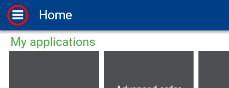
The icon will open a panel giving access to some global actions:
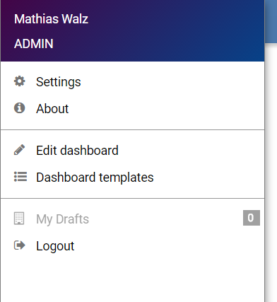
- User name / Role
Allows to change user, role and endpoint - Settings
Opens the Settings page - About
Opens the about page giving details about the product and license - Edit dashboard
Allows the user to customize his personal Welcome page - Dashboard templates
Allows the user to manage Welcome page templates - My Drafts (See Drafts)
- Logout
Page header
Every page is made up of a header which consists of the following items
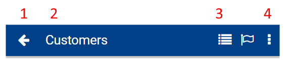
- Back button
Used to go to the previous page. Touch and hold the button to show the history of page to navigate quickly to one of the previously opened pages. - Page title
Touch and hold the button to show the history of page to navigate quickly to one of the previously opened pages. - Main actions
Most important actions of the page - Action panel icon
Used to open theAction panel.
Note: Not all of the above items may appear on every page
Action panel
The action panel is opened by using the action panel icon in the page header.
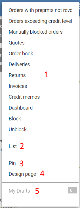
The content of the action panel depends on the active page and is usually made of elements of the kind:
1. Links and Actions
Links and actions not shown in the page header. Usually used to navigate to other pages.
2. Default navigation options
Used to navigate to other pages
3. Pin/unpin
Used to pin the current page to the welcome page of the user.
4. Design page
Used to open the design page mode to design the layout of the page.
5. My Drafts (See Drafts)
Settings page
The settings page allows to define very few basic settings used by the mobile client:
Used device type
Usually, the mobile client detects the kind of device it's running on and adopts it's layout accordingly.
On some rare devices this does not work properly so the type of device can be selected manually.
By default, this options should always be "Auto"
Business data
Some mobile apps cache data locally on your device to be able to access it even when beeing offline.
This option can be used to purge obsolete data from your device.
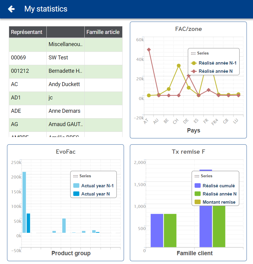
Dashboard pages
Dashboard pages are pages which consolidate information of one or more pages and shows every page in a so called vignette. These pages are frequently used to give an overview and allow the user to navigate to more detailed pages.
Types of pages
Chart detail pages
Chart detail pages are opened whenever the user clicks on a chart.
These pages render the chart and also the information used to build the chart in a grid based way.
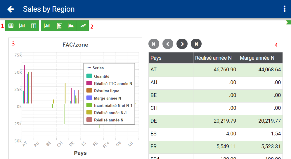
Chart detail pages can be customized by using the toolbar at the top of the page.
The toolbar offers two blocks of options:
1. Show data, chart or both
Used to enable or disable the rendering of the chart (3) or grid (4).
2. Chart type
Allows to change the type of chart
Query pages
Query pages show a list of items either in a grid or in card based way.
There are some additional controls available to help the user to adjust the visible data.
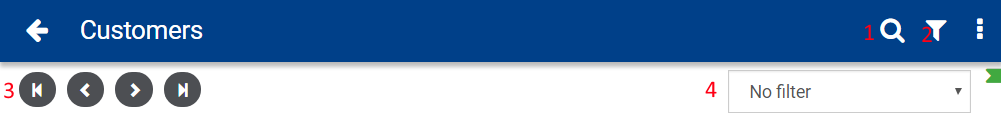
- Search icon
Used to show the text search input field - Filter icon
Used to open the sort and filter panel. - Pagination buttons
- Predefined filters
Detail pages
Detail pages show details of a record.

Eventually there are additional icons in the detail page that allow to do different operations
1. Go to the list of items
2. Delete the current record
3. Edit the current record
Edit pages
Edit pages allow to edit details of existing records or to create new ones.
On edit pages, there are usually the following additional options available in the header or action panel:
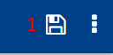
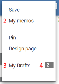
- Save button in header and action panel
- My memos to open memo management page
- My drafts to open draft management page (4. Actual number of drafts)
Search
The search is available at the top of grids in dashboard pages or by opening the text search input field on Query pages.
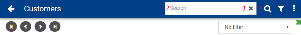
To use the search, enter the text to search in the text input field (2). Afterwards, click on the search icon (1) to execute the search and refresh the screen.
The search expression can be removed by clicking the cross icon (3) on the right hand side of the input field.
Note: When entering a search expression and visiting the page again later, the search expression will be automatically applied again.
Sort and filter panel
The sort and filter panel is divided into three main sections
Sort
The sort section shows a list of columns with arrow icons on the right hand side which allow to sort the list according to the selected column.
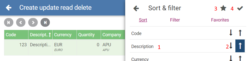
- The name of the column
- Arrow icon to select sort order of one particular column
- Store the currently set sort and filter criteria as a favorite to easily apply them later
- Apply the selected criteria
Filter
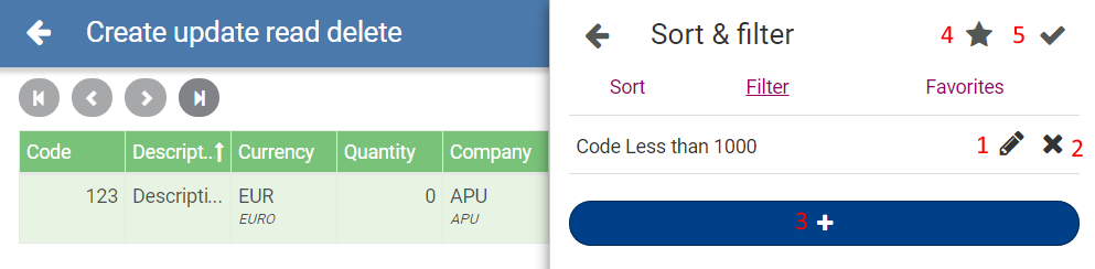
- Edit an existing filter crtiteria
- Delete an existing filter crtiteria
- Add a new filter criteria
- Store the currently set sort and filter criteria as a favorite to easily apply them later
- Apply the selected criteria
Favorites
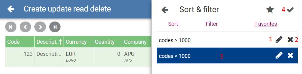
- Edit label of existing favorite entry
- Delete favorites
- Select a favorite entry to apply it using (4)