
Screens
Use this function to create and modify screens in the software by defining their description in a table. A screen is a tab or the upper section of a window in which several tabs or sections can be found. The confirmation of this description is then used to create the screen source and to compile it in the different languages in which the folder is generated.
Each screen is organized into sections, and each section contains one or more fields. A section is a field that can be entered, displayed, or hidden.
A screen is defined by its code and abbreviation. The code is unique in a folder but the abbreviation might not be. You need to make sure that it is not possible to open simultaneously two screens that have the same abbreviation. It is important that the different tabs for a single object have different abbreviations. For an object with the XXX code, the header screen is called XXX0, and the different tabs XXX1, XXX2, ..., XXXn. This standard is strongly recommended but not mandatory.
It is possible to insert graphs into Sage X3 screens by authorizing a graphical representation in a grid section. It can be a simple or multiple graph, in the form of a Gantt chart or based on an XSL component created in the screen components dictionary.
You can also insert webpages by creating browser sections and using the screen components dictionary.
It is possible to define screens in a VT format.
Prerequisites
Refer to the implementation documentation.
Screen management
A screen is defined in three tabs:
- The header
- The General tab
- The Fields tab
Header
Use the header to identify the screen and provide general characteristics.
General tab
Use this tab to identify the sections forming the screen.
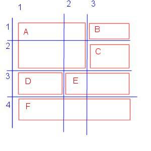
A section is a group of fields presented in a frame with an optional title. Each field on the screen must be positioned in a section. The entry order of the fields in each section is fixed. When the Tab key is used, the cursor moves from top to bottom and from right to left.
The position, line, and column fields are used to position sections. It is necessary to simulate a table for the section design. Indicate the position for each section using the line.column coordinates of its upper-left corner. Indicate the space occupied by the section using a number of lines and columns. For example:
|
Block |
Position |
Line |
Column |
|
A |
1.1 |
2 |
2 |
|
B |
1.3 |
1 |
1 |
|
C |
2.3 |
1 |
1 |
|
D |
3.1 |
1 |
1 |
|
E |
3.2 |
1 |
2 |
|
F |
4.1 |
1 |
3 |
Characteristics
| Activity code (CODACT) |
|
The screen is always generated if this field is not assigned. The screen is not generated if this field corresponds to an inactive activity code. |
| Module (MODULE) |
|
Select a module for the setup. Use this field to specify whether the screen has to be created in the folder database or not. It is only specified when the module linked to the screen is active in the folder. |
| Size (TYPMSK) |
|
Define your screen using one of the following types:
The Header, Tab, and Dialog box types require the additional entry of the number of lines and columns. Tab titles take one line and section contours take half a line per feature. The maximum dimensions are 28 lines and 112 columns (88 columns if there is a left list). These two line and column fields are considered as configuration parameters. A customization modification does not require protection by activity code. |
| (NBRLIG) |
| Enter the number of lines for your screen. |
| (NBRCOL) |
| Enter the number of columns for your screen. |
| Stacked (STACKED) |
| Set to Yes if you want the entire screen to be arranged in stacked mode. |
Scripts
Blocks grid
| Line number (NOBLOC) |
| Line number in the Blocks table. |
| Block title (ZTITBLOC) |
| The title of a section is optional. It appears in the upper part of the frame. This text is translatable. It can be evaluated. |
| Block type (TYPBLOC) |
|
This block type defines the presentation of the fields inside a block.
One variable parameter is required for Browser and HTML editor block types. For security reasons, other block types used in version 6 in web server mode are no longer used. |
| Position (POSBLOC) |
|
Indicate the section's position using the line.column coordinates of its upper-left corner. |
| Line (LINBLOC) |
| Indicate the space occupied by the section in number of lines. |
| Column (COLBLOC) |
| Indicate the space occupied by the section in number of columns. |
| Height (HTBLOC) |
|
Indicate a minimum number of lines for a table section if necessary. |
| Width (LGBLOC) |
|
Indicate a minimum number of columns for a table section if necessary. |
| Sequence (RANG) |
|
Specifies the entry order of sections. Blocks are entered in ascending order when moving by tabulation from one field to another. It is used in programming to identify a section. For example, write Affzo 10 to display all the fields in section 10. It is strongly recommended not to modify the rank of a section in the screen definition. |
| Length (LNGLIB) |
|
For a List type section, this field indicates the number of characters allocated to the title of each field. It can be 20, 15, or 12 characters depending on the available space. |
| Activity (ACTBLOC) |
|
Use this field to make a block of data optional.
|
| Line (NBLIGT) |
|
This field indicates the maximum number of lines in the table for a Table type section. |
| Options (OPTION) |
|
For a Table type section, this field contains a list of characters, each representing an authorized basic function (if present) in the table. You can select these characters via a selection window. The following functionalities are available:
|
| Stacked (BLOCSTACKE) |
| Set to Yes if you want the block to be arranged in stacked mode. |
| Column number (BLOCCOLNUM) |
| Indicate if you want the block to be on column 1 or 2. |
| Parameter (BASPAG) |
|
This field defines the name of the variable at the bottom of the table for a Table type section. It is a technical variable storing the number of lines actually entered. It must be defined as editable with the ABS data type in the Fields tab. Define this variable in invisible mode if a table section needs to be hidden.
|
| Representation (BLOCTYPT) |
|
Representation of the table section in the screen:
For the last three values, a screen for the graphical parameters is accessible from the contextual menu. |
| Grid block (DETBLC) |
|
This field is used for web services. Fill it in for tabs containing their own left list. For example, the Addresses screen (BPABPR). The associated table section number is indicated in the list section. |
| Dashboard view (BLOCVIEW) |
|
This field is used to select the portal view for Flash sections. |
Reference tables grid
| Line number (NBFIC) |
| Line number in the Reference tables grid. |
| Reference tables (FICREF) |
|
This table provides help for the entry of fields in the next tab. The system retrieves the characteristics of the fields in the listed tables. |
| Table title (INTITFIC) |
|
Title of the selected reference table. |
| URL definition |
|
Available for a Browser type section. Enables the entry of one to three URLs. You need to declare these in the Screen component function (GESAUR). |
| Definition of Office sections |
|
Available for an Office type section. Used to define the Office document type: Word, Excel, PowerPoint, or Universal. |
Fields tab
Use this tab to define all the fields on the screen.
You can define, in the Actions and Action parameters grids, the proces²²²ses to be run as well as the associated parameters for each field.
Fields grid
| Line number (NUMLIG) | ||||||||||||||||||
| The current line of the table. | ||||||||||||||||||
| Field (CODZON) | ||||||||||||||||||
|
Define the screen field’s name in this column. This code is composed of one to ten alphanumeric characters. The first character must be a letter. A field named FIELDNAME defined in the screen with the ABV1 abbreviation can be accessed by typing [M:ABV1]FIELDNAME. The field name is generally coded with three characters. These groups are capitalized in the Section coding function (GESACO). It is recommended to follow this standard. For custom/specific fields, the field name must start with X_, Y_ or Z_. |
||||||||||||||||||
| Block (NUMBLOC) | ||||||||||||||||||
|
Indicate the block number where the field should be positioned. |
||||||||||||||||||
| Position (NOZONE) | ||||||||||||||||||
|
Specify the field number.
|
||||||||||||||||||
| Description (ZINTIT) | ||||||||||||||||||
|
Specify a title to be placed on the left of the field (or on top in table mode). You can choose:
|
||||||||||||||||||
| Column (PDSZON) | ||||||||||||||||||
|
Use this field to position the fields in the same section. It is necessary to imagine a fictional table. The background text and the associated entry field each count as a column. Specify the number of columns occupied by the field here. W data type fields are expressed in a number of columns and not in a number of characters. The supervisor considers that the last field of a line takes the number of columns necessary to align the line according to the longest one. |
||||||||||||||||||
| Column number (COLNUM) | ||||||||||||||||||
| Indicate if you want the field to be in column 1 or 2. | ||||||||||||||||||
| Type (CODTYP) | ||||||||||||||||||
|
Specify the data type for the field. Additional information can be requested depending on the chosen data type. |
||||||||||||||||||
| Menu (NOLIB) | ||||||||||||||||||
|
This field defines the local menu number associated with the field defined on the line. When a field is of local menu type, it is stored as a numeric value (from 1 to 255) corresponding to the rank of a title in a table named local menu. This numeric value is stored in the APLSTD messages table. On entry or display, according to the choices made in the user interface, you can see either:
The benefit of this type of entry is that the list of choices is displayed in the user's connection language. Each local menu number characterizes the list of available titles. For example, local menu 1 corresponds to the No/Yes choice in this order. In this particular case, the user interface can also be a checkbox. |
||||||||||||||||||
| Length (LONG) | ||||||||||||||||||
|
Define the length of a field when this field uses a generic data type whose length is not fixed. This is the case for A and DCB types. For BLOBs and CLOBs, the maximum storage length must be entered. The codification is as follows:
|
||||||||||||||||||
| Input (SAIAFF) | ||||||||||||||||||
|
This information indicates whether the field should be entered or not. There are three possible values :
|
||||||||||||||||||
| Transmission (TRANSM) | ||||||||||||||||||
|
Indicate for a hidden field if its description should be taken into account in the XML description of the window. The possible values are:
For hidden fields in the technical section, this field must be set to All clients, as this technology is used to display XSL graphs. For other hidden field cases, it is recommended to put Not downloaded, except for specific reasons determined on a case-by-case basis. Note - information
There are two possible values for hidden section fields:
|
||||||||||||||||||
| Method (MODE) | ||||||||||||||||||
|
Use this field to manage the presence of the field according to the entry mode of a table.
The actions defined for the fields are active in both modes. |
||||||||||||||||||
| Activity (CODACT) | ||||||||||||||||||
|
Use this field to indicate whether the screen is to be created in the folder database. The screen is always generated if this field is not filled in. The screen is not generated if this field corresponds to an inactive activity code. Activity codes starting with X, Y, or Z make the entire screen specific. It is not affected by folder update. |
||||||||||||||||||
| Dimension (DIME) | ||||||||||||||||||
|
Indicate the field dimension. This dimension is automatically assigned in the case of a drop-down table. This dimension can also be automatically assigned if the field’s activity code includes a dimension. |
||||||||||||||||||
| Mandatory (OBLIG) | ||||||||||||||||||
|
This information indicates whether the field is mandatory or not. For an alphanumeric field, mandatory means that the field cannot be empty. For a numeric or date field, mandatory means that a null value cannot be entered. |
||||||||||||||||||
| Break after (BREAKAFTER) | ||||||||||||||||||
|
Set to Yes to insert a line break after the field, so the next field is on the next line. |
||||||||||||||||||
| Hidable (ISMASKABLE) | ||||||||||||||||||
|
Set to Yes for the field to be hidden if the size of the screen is too small. For example, the field can be visible on a desktop display and hidden on a mobile device. |
||||||||||||||||||
| Tunnel (TUNNEL) | ||||||||||||||||||
|
When the data type is associated with an object, this information is used to automatically create a tunnel available in the contextual menu of the field. This allows direct access to the management of this object. Note - informationThe tunnel is not proposed when the table managed by the object of this data type is the table indicated in first position in the General tab of the screen.
|
||||||||||||||||||
| Link (LIEN) | ||||||||||||||||||
|
If set to Yes, an additional field that displays the title of the selected field is added to the right of the field. You need to configure this field in the Title or Short title field in the General tab of the associated table. |
||||||||||||||||||
| Options (OPTSAI) | ||||||||||||||||||
|
The options depend on the data type (use the search window). This column defines the options applicable to the field entry. These options are represented by characters that can be concatenated when several options are required. It is possible to choose these options through a selection window. The available options depend on the field type. A detailed description of all possible options is available. The combination of these options allows the supervisor to apply a specific entry format to the field. You can set a specific format for the field using Sage X3 syntax through the contextual menu. The existence of this information is indicated by a $ in the field. This field allows you to enter options or an entry format. |
||||||||||||||||||
| Truncation (OPTLNG) | ||||||||||||||||||
|
Specify the display length if it is different from the entry length. The entry in this field is scrollable. By default, on alphanumeric fields longer than 30 characters, the supervisor sets a display length of 30 characters. This entry format is taken into account when no indications are provided on the field format and the data type linked to this field. |
||||||||||||||||||
| Default value (VALDEF) | ||||||||||||||||||
|
Specify an expression used to initialize the field. If the expression is preceded by the * character, the default value is always assigned, even if the field is already initialized. For an icon field, the value entered here indicates the icon to be displayed. For example:
To avoid displaying the icon, leave the field empty. |
||||||||||||||||||
| Access code (CODACC) | ||||||||||||||||||
|
If this field is not filled in, the field is always accessible to users. If this field is filled in, a user can only access the field if he is authorized by the corresponding access code. This possibility to restrict access to a field is reserved for specific or custom fields and does not require protection by an activity code. |
||||||||||||||||||
| Entry condition (CONSAI) | ||||||||||||||||||
|
The field is defined as being enterable. However, under certain conditions it is not. The entry condition is a logical expression written in Sage X3 syntax. If the expression is true during entry, the field is entered. If not, it is displayed and its value is saved. Example: To enter a field only if the previous field is set to Yes, enter [M]ZONEPREC=2. |
||||||||||||||||||
| Graphic object (TYPGRAPH) | ||||||||||||||||||
|
Use this field to specify the type of graphic object used:
On a table section field, the authorized objects are checkbox and icon. After selecting the graphic object type, it is possible to configure its display by right-clicking and selecting Parameters in the drop-down list. A Graphic parameters window appears. |
||||||||||||||||||
| Style (STYZON) | ||||||||||||||||||
|
You can add a specific style on the field by parameter setting. This is reserved for customization. Updating this field does not require protection by an activity code. |
||||||||||||||||||
| Control table (CODCTL) | ||||||||||||||||||
|
You can define here a control table to check the entry and, in some cases, to provide a selection of the possible values. This is reserved for customization. Updating this field does not require protection by an activity code. |
||||||||||||||||||
| Setup (ACHPARG) | ||||||||||||||||||
|
Set of parameters available to load the graph with the table fields. These parameters are described in the miscellaneous table 915. |
||||||||||||||||||
| Representation (CHREPR) | ||||||||||||||||||
|
Define the graphical representation of the table column. This information is necessary for graphs:
|
Actions grid
Use this grid to identify the sub-programs that will be run before or after the entry of a field.
It also allows you to identify the actions of the contextual menu for the field.
Define this table for each field when necessary.
| Line number (NOAC) |
| The current line of the table. |
| Type (TYPACT) |
|
You can define the particular actions associated with the field. The possible action types are:
|
| Action (ACTION) |
|
The action code refers to the action table that specifies the sub-program to be called. Three particular codes exist: STD, SPE, and SPV. These codes indicate that the action is not cataloged but uses a label that is defined respectively in the standard processes for STD, specific or custom processes for SPE, and vertical processes for SPV. |
| Description (ZINTITACT) |
| This field allows you to describe the action in a few words. |
| Execution (EXEACT) |
|
Define the action's execution context:
|
| Deactivation (DISACT) |
|
This field is available for specific and vertical developments. You can specify:
|
Action parameters grid
Use this grid to assign values to the parameters used in actions.
A single parameter table is defined for all the actions associated with a field.
| No. (NOPA) |
| The current line of the table. |
| Description (CODPAR) |
|
This part of the screen allows you to define the value of some parameters. Enter the parameter code here. These parameters correspond to the actions defined for a field. For example, for the postcode checking action, the country code and city fields must be provided. Be careful to respect the parameter type specified in the help. |
| Value (VALPAR) |
|
This part of the screen allows you to define the value of the selected parameter. Enter the value assigned to the parameter here. These parameters correspond to the actions defined for a field. For example, for the postcode checking action, the country code and city fields must be defined. Be careful to respect the parameter type specified in the help. |
| File field selection |
|
This action is available from the Fields tab. You can automate the creation of fields on the screen based on the tables specified in the Header tab. |
| Enter ticket |
|
This action is available from the Actions grid. You can access in editing mode the sub-programs of the STD, SPE, or SPV actions related to the SUBxxx, SPExxx, or SPVxxx processes. |
Reports
By default, the following reports are associated with this function:
- AMSK: Screen dictionary
- AMSKLIST: List of screens
You can change this through a different setup.
Specific buttons
-
Validation
This button generates the *.msk file in the ECR directory. This file is language-independent. It contains the actions to execute and the formats.
Validation generates the automatic processes linked to the screen. For example, W0xxxxxxx for import and W1xxxxxxx for interactive mode, where xxxxxxx is the screen code.
-
Copy
This button allows you to copy the screen definition to another folder.
Note - warningValidate the screen in the destination folder after copying.Block 1
OBJET
This field indicates that you are copying a screen. CLES
This field displays the code of the screen that you are going to copy. Block 2
From folder (DOSORG)
Indicate the folder from which the record is going to be copied. The possible syntaxes are described in the dedicated appendix.
All folders (TOUDOS)
Use this option to copy the record to all the folders defined in the dictionary (ADOSSIER table of the current solution).
To folder (DOSDES)
Indicate the folder to which the record is going to be copied. The possible syntaxes are described in the dedicated appendix.
-
Preview
Click this button to view the result. You need to validate the screen before.
-
Web preview
Click this button to view the result in web mode. You need to validate the screen before.
Menu bar
The following operation is available from the Actions menu.
View/VT screen
Available on VT screens. Allows you to display the screen as a log file.
Error messages
Other than the generic messages, the following error messages can appear when entering data:
No section defined
An attempt has been made to save a screen without defining its section.
Two sections with the same rank exist
Each section defined in the screen must have a unique rank. The rank is the unique identifier for the section.
xxxxxx: Non-existent variable at the bottom of the table
In the table section definition, a field from the second tab of ABS data type assigned to this block must be indicated in the footer column.
The footer variable must be the first of the section
In the table section definition, a field from the second tab of ABS data type assigned to this block must be indicated in the footer column.
This field must also be the first field declared in the section.
n: Non-existent section
Fields in the second tab are assigned to a section not defined in the first tab.
Number of fields too big (> 32,768)
Control of the limit of 32,768 active field dimensions per screen.
- For table sections, one field per column is counted, regardless of the number of rows in the table.
- For list sections, the field dimension is included in the calculation.
Too many lines (> 500)
Control on the limit of 500 active fields per screen, regardless of their dimension.
A standard screen should not exceed 300 fields, in order to keep at least 200 fields available for partners.
Tables used
Refer to the implementation documentation.